Widget Types and Operation
HyperVisu offers a comprehensive range of widgets designed to control and monitor various home automation components through the KNX system. Each widget type provides specific functionality tailored to its purpose.
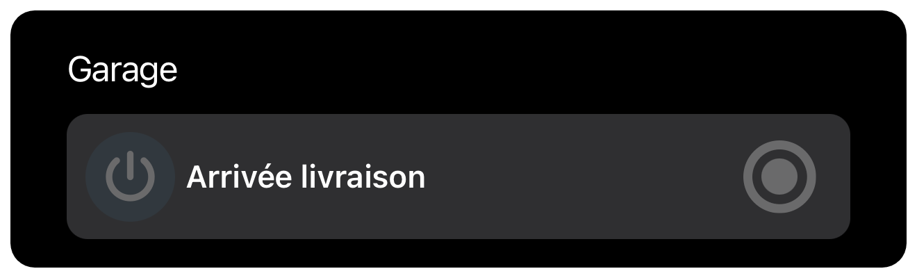
Push Buttons
Push buttons are simple control elements that send a command to the KNX bus when pressed.
Operation
- Appearance: Displays the widget name and icon alongside a pushbutton.
- Interaction: The button changes to the active color when pressed.
- Functionality: When pressed, the widget sends an event to the serve
Pushbutton Types
HyperVisu supports four different types of pushbutton functionality:
- ON Pushbutton (Type 1)
- Sends an ON command (value 1) to the device when pressed and released
- The button action is independent of the current state of the controlled device
- OFF Pushbutton (Type 2)
- Sends an OFF command (value 0) to the device when pressed and released
- The button action is independent of the current state of the controlled device
- Toggle ON/OFF Pushbutton (Type 3)
- Sends alternating ON or OFF commands with each press
- Automatically takes into account the feedback value received from the device
- Requires a status feedback object configured to update the button's state
- Send Value Pushbutton (Type 4)
- Sends a specific predefined value stored in object 1 to the device when pressed
- Can be configured to send any value (not just ON/OFF)
- Useful for sending scene numbers, percentage values, temperature setpoints, or other numeric values
- The value to be sent is configured in the ElauPro configuration
- Use Cases: Push buttons are ideal for triggering scenes, sending specific values to the KNX bus, or executing momentary controls such as doorbell or gate controls.
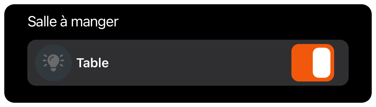
Light Switches
Light switches provide simple on/off control for lighting circuits with status feedback.
Operation
- Appearance: Displays the widget name and icon alongside an on/off switch.
- Interaction: The switch changes to the active color when its status is ON.
- Functionality:
- When toggled, the new switch status is immediately sent to the KNX bus
- If the status changes from another source (like a physical switch), the application automatically updates the switch position
- Feedback: The switch position always reflects the actual state of the light
- Global Commands: Light switches are included in global lighting commands and appear in the active light point count in room views
Dimmers
Dimmers allow for variable intensity control of lighting.
Standard Dimmer
Standard dimmers control the brightness of a single light fixture.
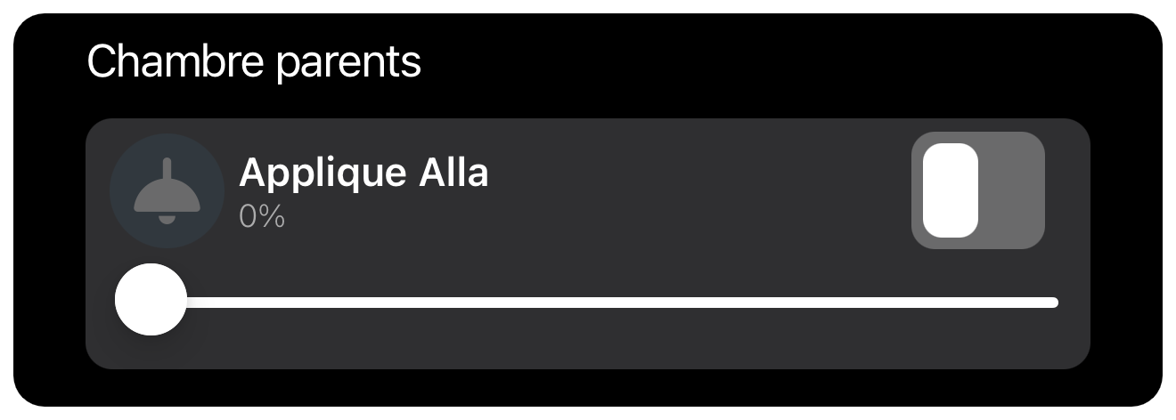
Operation
- Appearance: Displays the widget name, icon, on/off switch, and a slider for brightness control.
- Interaction:
- The on/off switch toggles the light
- The slider adjusts brightness from 0% to 100%
- The current brightness value is displayed with % unit
- Functionality:
- Switch status is updated both from the app input and from KNX bus feedback
- Brightness value is sent to the KNX bus when the slider is released
- The app display updates when brightness changes occur from other sources
- Status Indication: The switch reflects the current on/off state, and the slider position shows the current brightness level
RGBW Dimmer
RGB dimmers allow control of both brightness and color for compatible RGB lighting.
Operation
- Appearance: Displays the widget name, icon, on/off switch, a slider for brightness, and color selection.
- Interaction:
- The on/off switch toggles the light
- The slider adjusts brightness from 0% to 100%
- The slider color displays the currently selected RGB color
- Tapping on the widget opens the detailed color selection interface
- Functionality:
- The color selection interface allows choosing any color from the RGB spectrum
- RGB values are sent to the KNX bus when a new color is selected
- Both brightness and color information update if changed from another source
Tunable White Dimmer
Tunable white dimmers control both brightness and color temperature of white light.
Operation
- Appearance: Displays the widget name, icon, on/off switch, and a slider for brightness control.
- Interaction:
- The on/off switch toggles the light
- The slider adjusts brightness from 0% to 100%
- Tapping on the widget opens the detailed view with brightness and color temperature controls
- Functionality:
- The temperature slider adjusts from warm white to cool white
- Brightness and temperature values are sent to the KNX bus when sliders are released
- Both values update if changed from another source
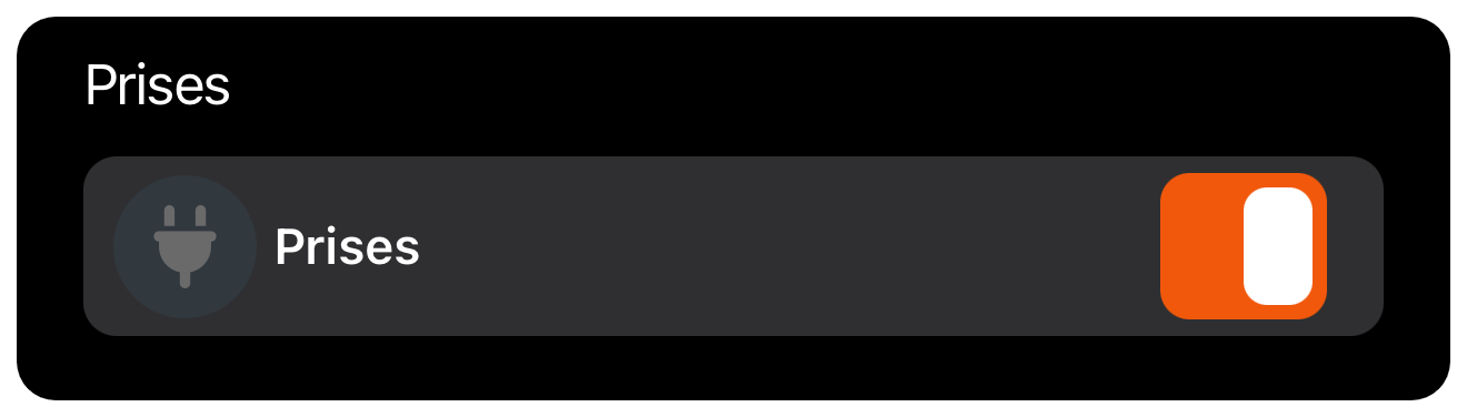
Switches
Switches provide on/off control for general electrical circuits, typically used for power outlets.
Operation
- Appearance: Displays the widget name and icon alongside an on/off switch.
- Interaction: The switch turns orange when its status is ON.
- Functionality:
- When toggled, the new switch status is immediately sent to the KNX bus
- If the status changes from another source, the application automatically updates the switch position
- Differentiation from Light Switches: Unlike light switches, general switches are not included in global lighting commands and do not affect the active light point count
Shutters/Blinds
Shutters and blinds widgets control motorized window coverings with precise positioning capabilities.
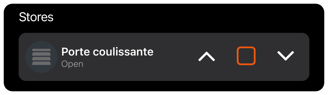
Simple Shutters
Simple shutters provide basic up/down and positioning control.
Operation
- Appearance: Displays the widget name, icon, and three control buttons (Up, Stop, Down).
- Position Indication: Shows the current position (0% = fully open, 100% = fully closed).
- Interaction:
- The Up/Down buttons move the shutter in the corresponding direction
- The Stop button halts movement immediately
- The buttons change to the active color when the shutter is moving in that direction
- Tapping on the widget opens the detailed view with position slider
- Detailed View:
- Provides a vertical slider for precise position control
- Displays the current percentage position
- Allows direct setting of the desired position by adjusting the slider
Adjustable Slat Blinds
Adjustable slat blinds add slat angle control to the basic shutter functionality.
Operation
- Appearance: Similar to simple shutters with the addition of slat control in the detailed view.
- Interaction:
- Basic controls (Up, Stop, Down) operate the same as simple shutters
- The detailed view provides two sliders:
- A vertical slider for blind position (0-100%)
- A horizontal slider for slat angle (0-100%)
- Functionality:
- Position values are sent to the KNX bus when sliders are released
- Position and slat angle update if changed from another source
- Both position values are displayed with percentage units
- Status Feedback:
- Moving Up/Down indicators show when the blind is in motion
- Position values display real-time feedback from the blind actuator
- Labels can be customized (e.g., "Open"/"Closed") in the configuration
Climate Controls
Climate Controls provide comprehensive management of your KNX-compatible heating and cooling systems, allowing precise temperature regulation throughout your building.
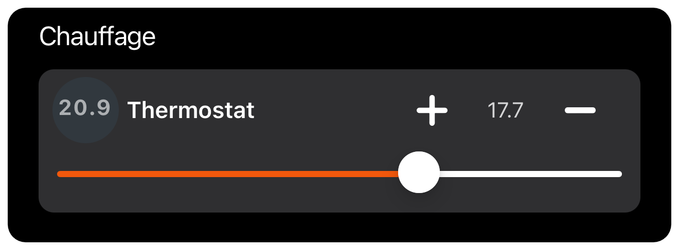
Temperature Setpoint Adjustment
Temperature control widgets allow you to monitor and adjust the temperature in different zones of your building.
Operation
- Basic View: The widget displays:
- Current room temperature with unit (°C) and the specified number of digits
- Current temperature setpoint
- Increase (+) and decrease (-) buttons for adjusting the setpoint
- A slider for smooth temperature adjustment
- Interaction:
- Press the + button to increase the temperature setpoint in 0.2°C increments
- Press the - button to decrease the temperature setpoint in 0.2°C increments
- Use the slider for more precise temperature adjustment
- The new setpoint is sent to the KNX bus when you release the slider or press a button
- Feedback:
- The current room temperature updates in real-time based on feedback from temperature sensors
- The setpoint value updates if changed from another source (like a physical thermostat)
- The orange portion of the slider indicates the current setpoint relative to the available range
Operation Modes (Comfort, Standby, Night)
Climate controls offer different operation modes to match your heating and cooling needs with your daily routines.
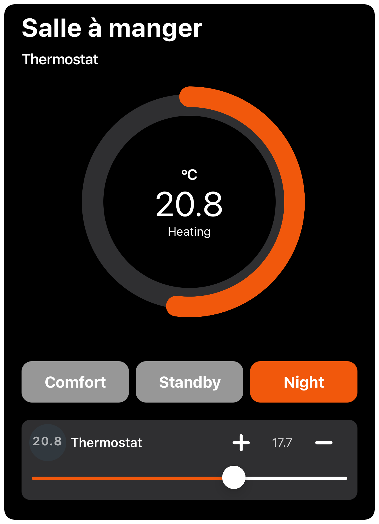
Operation
- Detailed View: Tap on the temperature widget to access the detailed view, which displays:
- A circular temperature indicator showing the current temperature
- The heating or cooling type of controller
- Three mode buttons: Comfort, Standby, and Night
- Temperature setpoint controls
- Mode Functions:
- Comfort Mode: Uses the exact temperature setpoint you've specified
- Standby Mode: Automatically reduces the temperature by 3°C from the comfort setpoint (for heating) or increases it by 3°C (for cooling)
- Night Mode: Automatically reduces the temperature by 1.5°C from the comfort setpoint (for heating) or increases it by 1.5°C (for cooling)
- Mode Selection:
- The currently active mode button is highlighted in orange
- Tap any mode button to switch to that mode
- The system sends the corresponding command to the KNX bus
- The actual temperature setpoint adjusts automatically based on the selected mode
- Visual Indication:
- The circular indicator shows your current temperature in large digits
- The "Heating" or "Cooling" label indicates the active operation
- The orange arc around the circle represents the current temperature relative to the setpoint
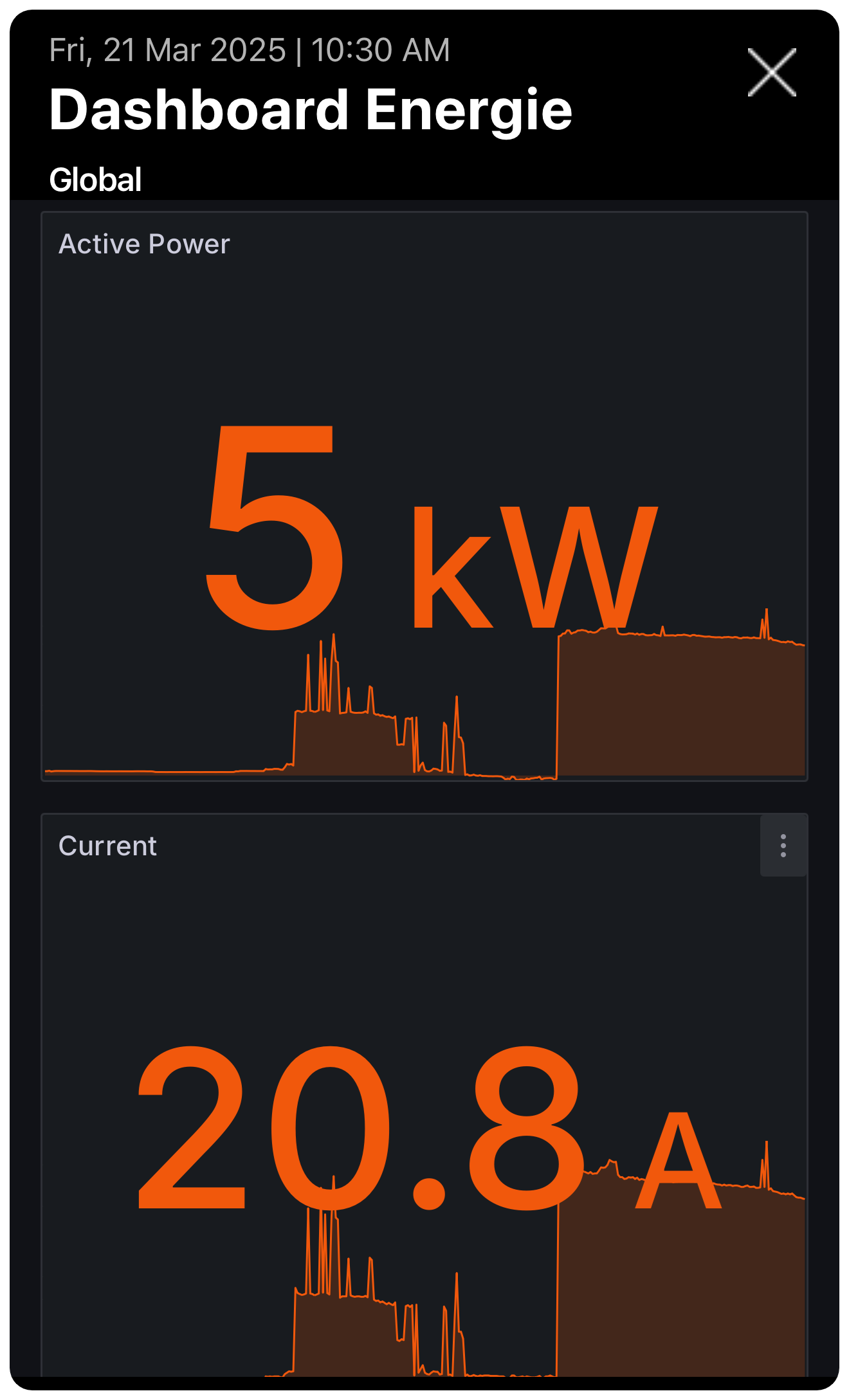
Analog Inputs
Analog Input widgets display measurement values from various sensors connected to your KNX system, such as temperature, humidity, power consumption, and more.
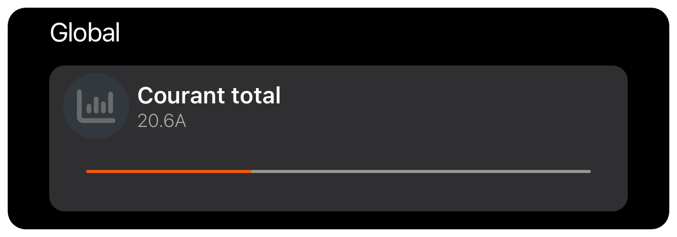
Value Display
Analog Input widgets show real-time values with appropriate units for monitoring various metrics.
Operation
- Appearance: The widget displays:
- The widget name and icon
- The current measurement value with configurable units and decimal places
- A visual bar indicating the value relative to its configured minimum and maximum range
- Functionality:
- Values are automatically updated when new data is received from the KNX bus
- The filled portion of the bar indicates where the current value falls within the defined range
- The color of the bar (typically orange) provides visual indication of the value's intensity
Trending Function
The trending function enables historical data visualization for analog inputs, allowing you to track changes over time.
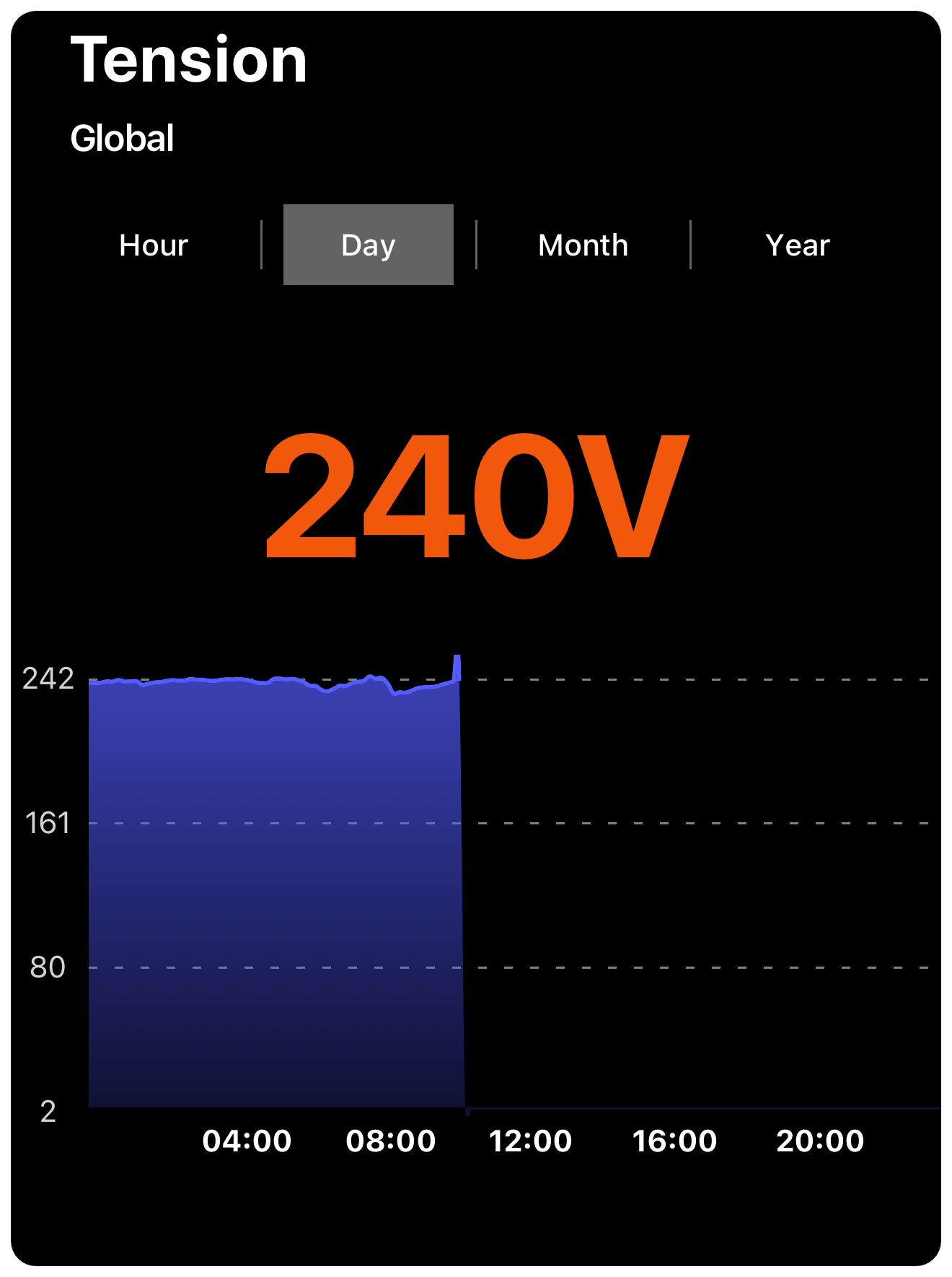
Operation
- Access: Tap on an Analog Input widget configured for trending to open the trend view
- Trend View Features:
- Current value displayed prominently at the top
- Graph showing historical data for the selected time period
- Time range selector with four options: Hour, Day, Month, and Year
- Y-axis scale that automatically adjusts to the data range
- X-axis showing time increments appropriate for the selected range
- Interaction:
- Tap different time range buttons (Hour, Day, Month, Year) to change the time scope
- Tap on the graph to see specific values at different points in time
- Setup Requirements:
- The "Trend" subtype must be selected for the widget in ElauPro
- Data is automatically stored in the InfluxDB database on the HyperVisu server
Digital Inputs
Digital Input widgets display the status of binary sensors or switches in your system.
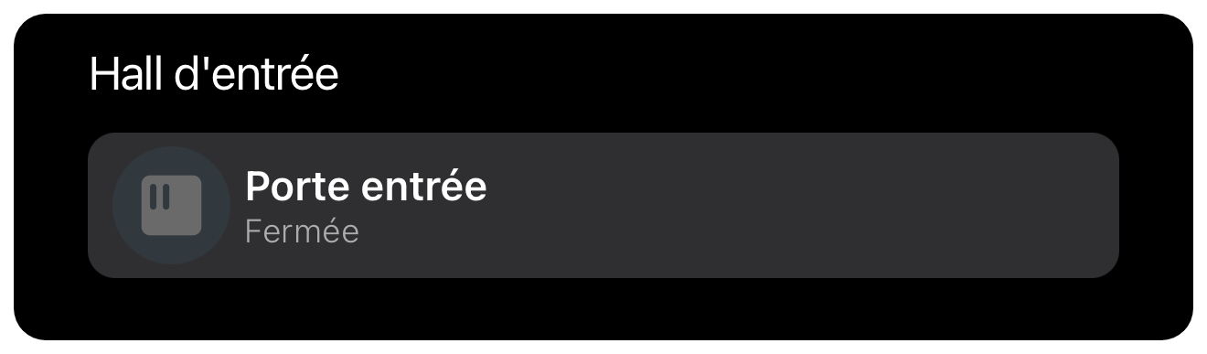
Operation
- Appearance: The widget displays:
- The widget name and icon
- The current status label, which can be customized (e.g., "On"/"Off", "Open"/"Closed", "Running"/"Stopped")
- Status Indication:
- The widget shows one of two possible states based on the binary input
- Custom status labels can be defined in ElauPro by editing the corresponding object's “Min label” (for value 0) and “Max label” (for value 1)
- No direct user interaction is possible; the widget is for display purposes only
WebView Widgets
WebView widgets allow you to integrate web content directly into your HyperVisu interface, particularly useful for displaying Grafana dashboards.
Operation
- Configuration: In ElauPro, you can specify the URL of the web page to be displayed
- Content: Typically used to embed Grafana dashboards for advanced data visualization
- Interaction: The embedded web page is fully interactive within the HyperVisu application
Camera Integration
Camera widgets allow you to view live video feeds from compatible IP cameras throughout your property.
Operation
- Configuration: The camera's RTSP video stream URL is specified in ElauPro
- Viewing: Tap on the camera widget to open the live video stream
- Supported Formats: RTSP, HTTP, and RTSP over HTTP streaming protocols are supported
Note : Remember that camera streams may use significant bandwidth when active
Virtual Widgets
Virtual widgets enable integration with non-KNX devices and systems through Node-RED, expanding the capabilities of your HyperVisu system beyond standard KNX functionality.
Features
- Protocol Independence: Uses the "virtual" protocol instead of KNX
- Node-RED Integration: Commands and states are processed through Node-RED flows
- Bidirectional Communication:
- Sends commands from the HyperVisu application to external systems
- Receives data from external sensors or systems for display in the app
Applications
- IoT Device Integration: Connect to smart devices using various protocols
- Cloud Service Communication: Interface with weather services, energy providers, or other online data sources
- Non-KNX Systems Control: Integrate with proprietary home automation components
- Custom Logic Implementation: Create complex automation rules combining KNX and non-KNX elements
Hidden Widgets
Hidden widgets are configuration elements that exist in the system but don't appear in the user interface, useful for background operations and logic functions.
Purpose
- Background Processing: Create logic elements for use in Node-RED without cluttering the user interface
- System Variables: Store and manipulate values used by multiple automation processes
- Intermediate Controls: Provide connection points between different automation systems
Configuration
- Widgets can be hidden by unchecking the "visible" option in ElauPro's widget configuration
- Hidden widgets retain all functionality but are not displayed in the mobile application
- They remain accessible in Node-RED for programming and automation purposes
On this page
Need additional help?
Our support team is available to answer your technical questions.
Contact support