Complexity, Simplified.
True smart building technology should be invisible to the user and effortless for the professional. We bridge the gap between robust industrial standards (KNX) and modern IoT flexibility. By designing solutions that are simple to configure, reliable to run, and open to everything, we empower integrators to deliver seamless projects in record time.
Who we are?
Elausys is a leading innovator in smart building and home automation solutions using the KNX Standard. We specialize in creating integrated systems that enhance the efficiency, security, and comfort of residential and commercial properties.
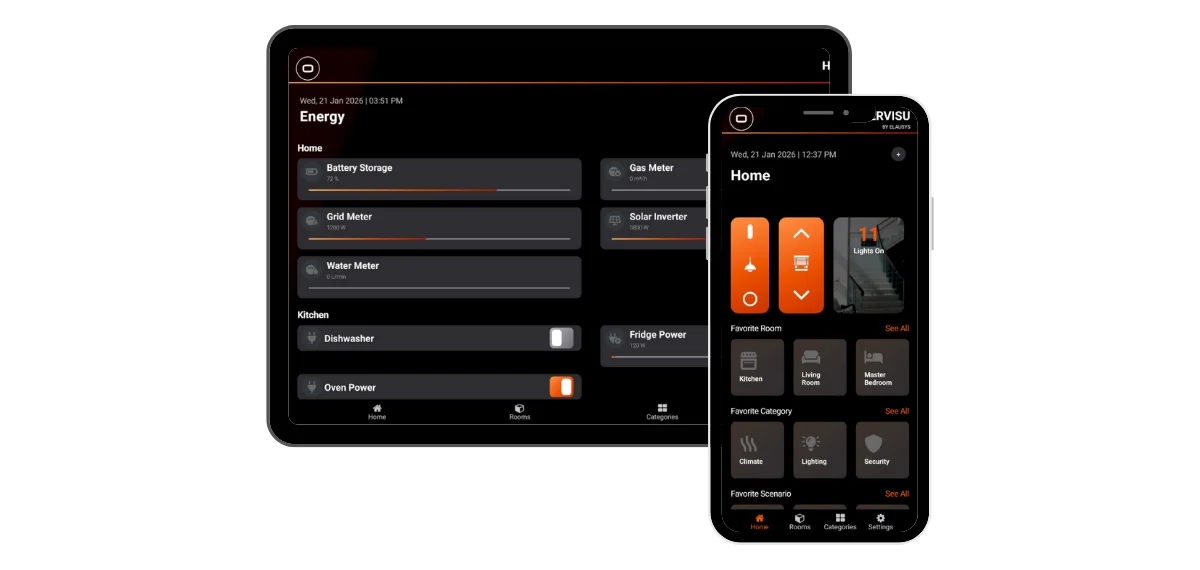
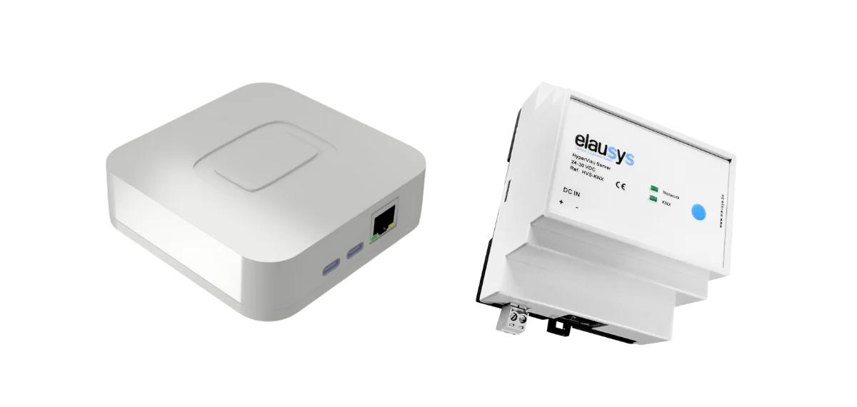
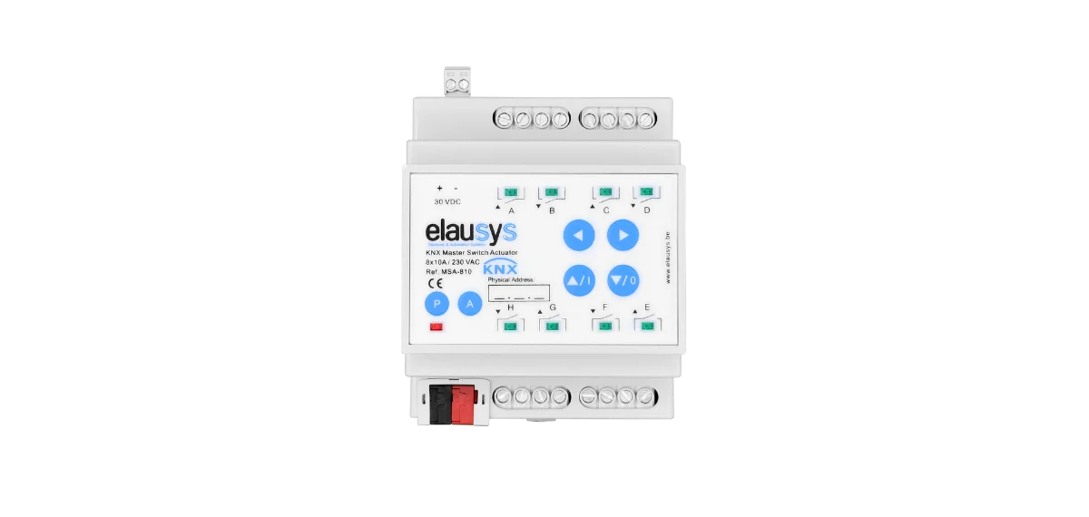
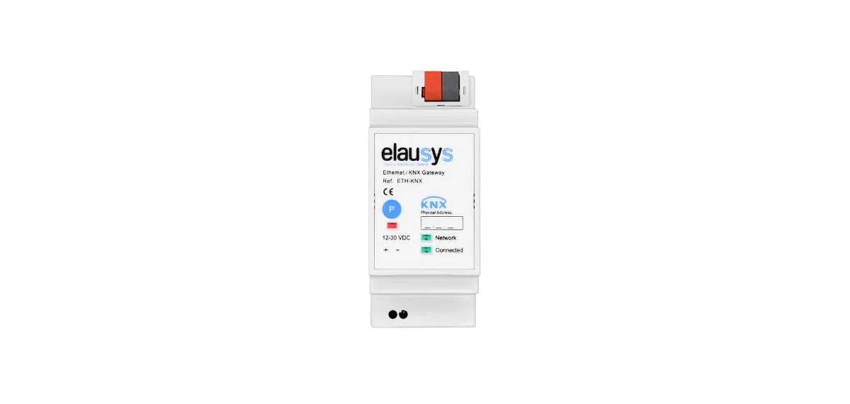
Our Solutions
A complete ecosystem designed to make smart buildings work seamlessly.

Ready to Build Smarter?
Whether you are an integrator looking for efficiency or a building owner seeking simplicity, Elausys is your partner in intelligent automation.
System Integrator
Need solutions that are easy to install and increase your margins while keeping your clients happy?
Property Developer
Want to boost property value and stand out with innovative and long-lasting smart home solutions?
Home Owner
You dream of a reliable Smart Home but don't know where to start? We connect you with Elausys partners worldwide.
Stay informed about the latest home automation trends
Receive our best articles and advice directly in your inbox.