Graphics are SVG drawings wired to the installation: a floor plan whose lamps light up, a heating diagram whose pumps spin, an energy flow whose arrows run with the power, a security plan whose door contacts turn red. You prepare them on the admin panel's Graphics page; residents place them on their views (see “Graphics on Your Views”). The Graphics page is its own entry of the BUILDING group in the sidebar, next to Logic.
A graphic is made of four things:
| Part | What it is |
|---|---|
| The drawing | An SVG document: something you drew or exported, a background picture, or an empty canvas you fill with symbols |
| Symbols | Ready-made shapes from the library (a lamp, a shutter, a pump, a value pill…) placed on the drawing, with their bindings and actions pre-wired |
| Bindings | Rules that change a shape when a value changes: a colour, a text, a class, a position, an animation |
| Actions | What a tap, a double tap or a long press on a shape does: toggle a device, run a scenario, open a room, go to a view |
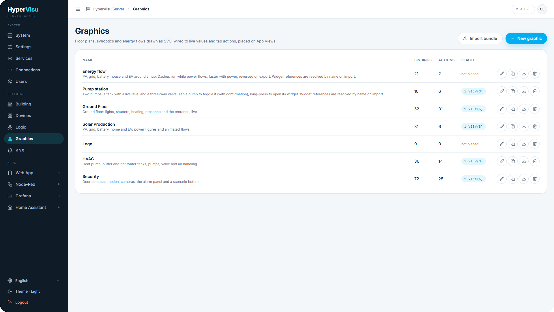
The Graphics page. The table lists every graphic with its number of bindings and actions and where it is Placed ("2 view(s)" or "not placed"). Each row offers Edit, Duplicate, Export and Delete. Above the table: New graphic and Import bundle.
⚠️ Warning: Deleting a graphic that is placed on views removes those placements too — the dialog tells you on how many.
Creating a graphic
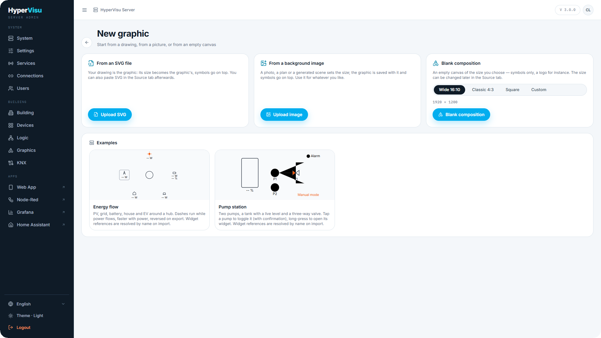
Click New graphic. The first screen asks how the drawing starts:
| Start | What happens | Size of the graphic |
|---|---|---|
| From an SVG file | Your drawing is the graphic. Symbols go on top of it, and you can bind the shapes it already contains. | The file's own size |
| From a background image | A photo, a scanned plan or a generated scene becomes the background. The graphic is created and saved at once, with the picture stored on the server. Symbols go on top. | The picture's size |
| Blank composition | An empty canvas — symbols only, a logo for instance. Choose Wide 16:10, Classic 4:3, Square or a Custom width and height. | The size you choose |
| Examples | Two complete graphics that ship with the server: Energy flow and Pump station. They are imported as copies you can edit; their device references are matched by name. | The example's size |
A graphic's size is its coordinate space, shown in the Source tab as Graphic dimensions. You can change it later; the whole drawing rescales with it. A background image always sets it to the picture's own size.
💡 Tip: A light picture (white paper) needs dark strokes whatever the app theme. When you start from a light background image, the Colours setting is switched to Light drawing for you (see Testing, settings, export below).
The editor
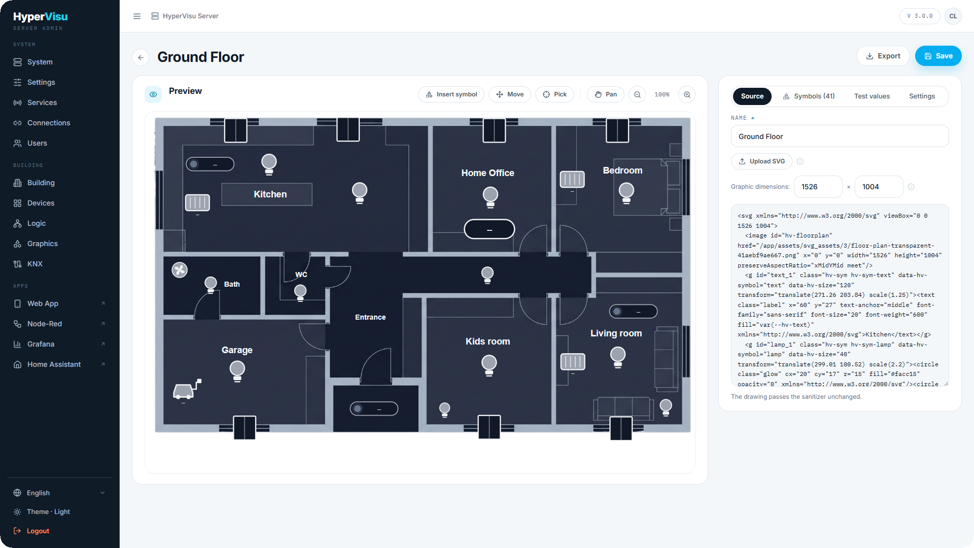
The editor has two columns. On the left, the Preview draws the graphic exactly as the apps will, with a toolbar:
| Button | What it does |
|---|---|
| Insert symbol | Opens the symbol library (see Symbols below) |
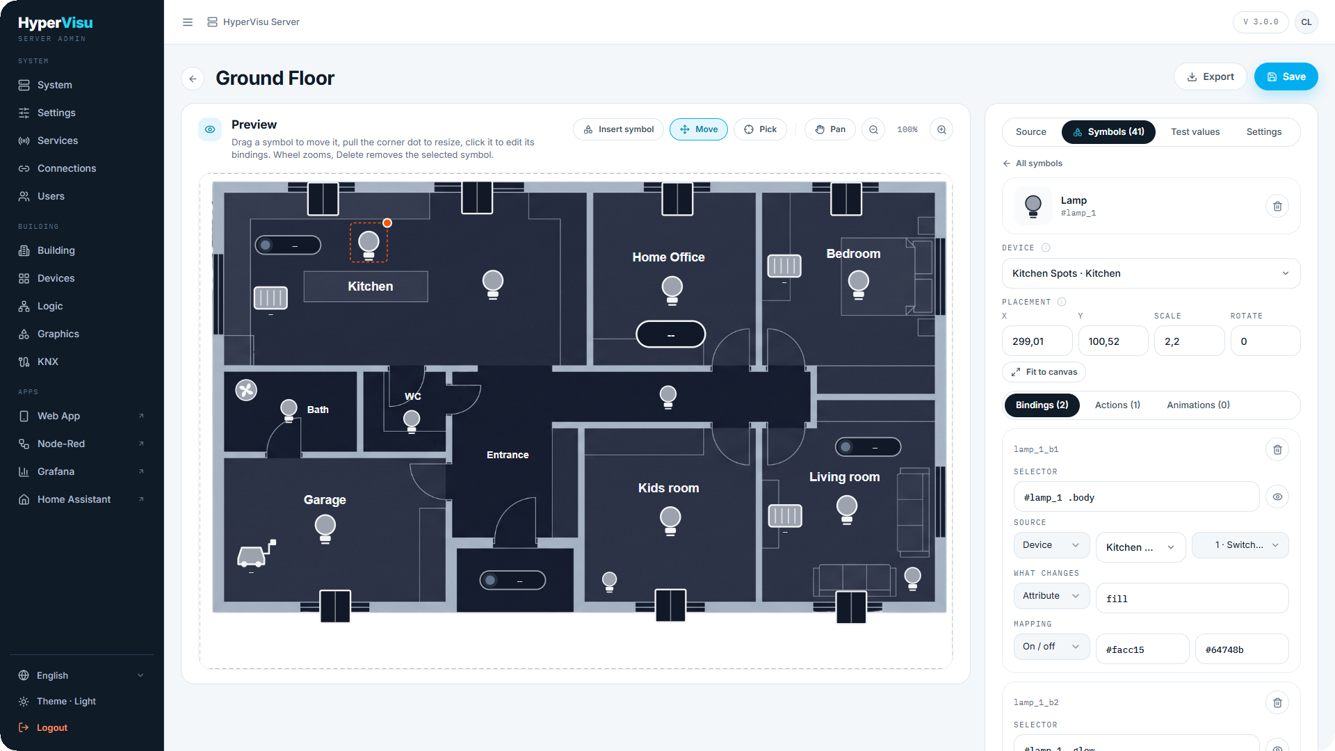
| Move | Compose mode: drag a symbol to move it, pull the orange dot on its corner to resize it, click it to edit its bindings, press Delete to remove it, Escape to deselect |
| Pick | Click any shape of the drawing to select it and edit its bindings — for hand-drawn shapes rather than symbols |
| Pan, Zoom out, Zoom in | Move around and zoom the preview; the mouse wheel zooms too; click the percentage to return to 100 %. The zoom is only your view of the drawing, it changes nothing in the graphic |
On the right, four tabs:
- Source — the name, Upload SVG, the Graphic dimensions, and the SVG text itself, which you can edit directly. Under it, the sanitizer's verdict: "The drawing passes the sanitizer unchanged", or the list of what was removed.
- Symbols (n) — every symbol placed on the drawing, plus Other elements for the drawing's own shapes (see Symbols below).
- Test values — feed the preview with values (see Testing, settings, export below).
- Settings — description, colours, fit, background, extra CSS and image assets (see Testing, settings, export below).
What the sanitizer does. The server cleans every drawing when it is saved: scripts, event handlers, links and external images are removed, animations are restricted to safe attributes. A drawing may weigh at most 2 MB. What the sanitizer changes is listed under the source so nothing disappears silently.
Saving. Nothing reaches the apps until you click Save. If a binding or an action is incomplete — a symbol with no device, a selector that matches nothing — the save is refused and the editor opens the row in question with the reason.
Symbols
Symbols are the fastest way to build a graphic: each one comes with the bindings and actions it needs, so placing a lamp and choosing its light is enough to make it live.
The library. Click Insert symbol. The dialog is grouped by category, with a search box.
| Category | Symbol | What it shows and does |
|---|---|---|
| Lighting | Lamp | The bulb lights up and glows when the light is on; tap toggles it |
| Climate | Radiator | A radiator with its temperature; tap opens the room |
| Climate | Fan | Spins while running; tap toggles it |
| Openings | Shutter | A window whose cover follows the shutter position |
| Technical room | Pump | Green and spinning while running; tap toggles it after a confirmation |
| Technical room | Valve | A two-way valve with its open side highlighted; tap toggles it |
| Technical room | Tank | A tank whose fill and figure follow a level in percent |
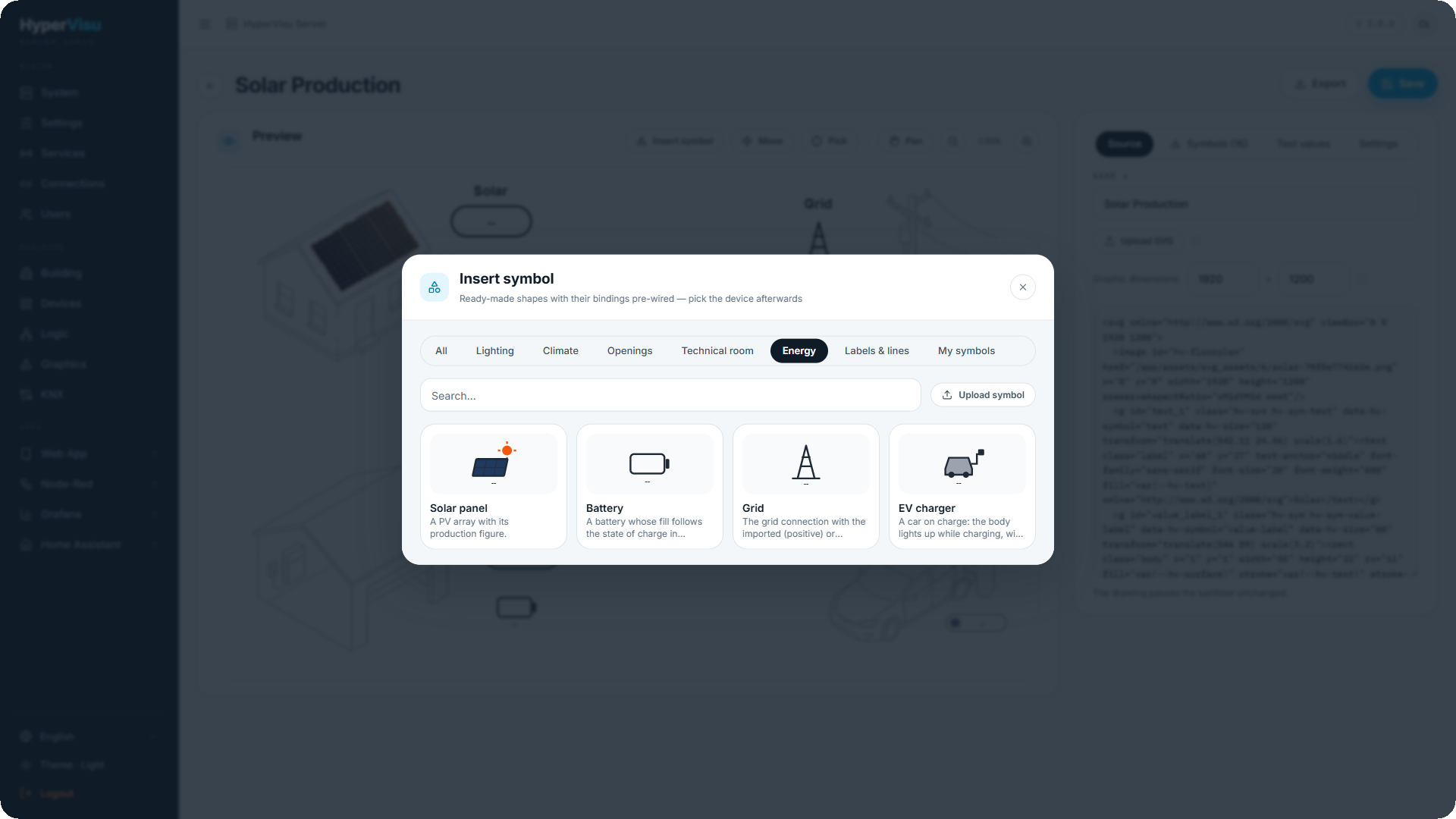
| Energy | Solar panel | A PV array with its production figure |
| Energy | Battery | A battery whose fill follows the state of charge |
| Energy | Grid | The grid connection, green while exporting, with the power |
| Energy | EV charger | A car that lights up while charging, with the charging power |
| Labels & lines | Flow line | A dashed arrow whose dashes run while power flows, faster with more power, backwards when the sign flips |
| Labels & lines | Analog value | A pill showing any reading with its unit; tap opens the device |
| Labels & lines | Text | A free label you write yourself; scale and rotate it like any symbol |
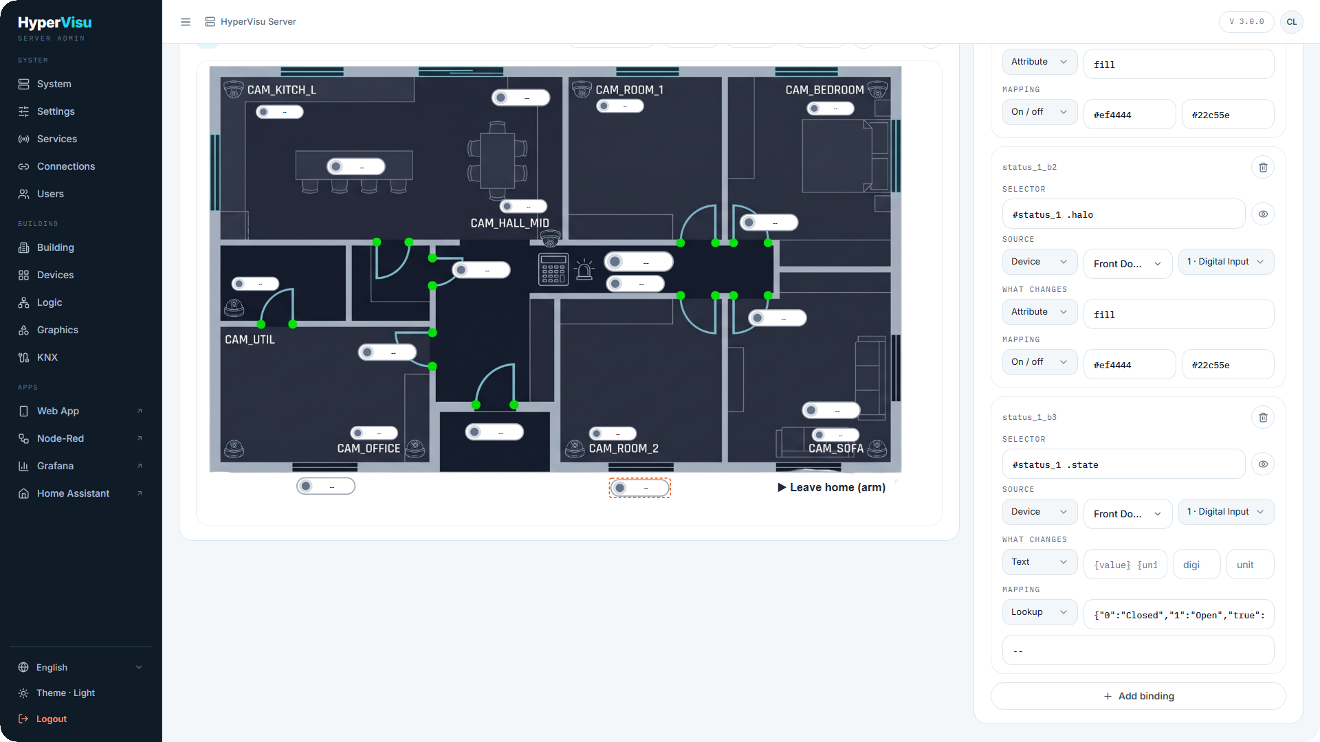
| Labels & lines | Status indicator | A coloured dot with a state word for a digital input — open / closed, on / off |
| Navigation | Hotspot, Hotspot (wide) | An invisible tappable area to lay over a room of a plan; a tap goes to a room, a category, a view or a device. Tinted blue in the editor only, never in the apps |
| My symbols | your own | Icons you uploaded (see below) |
Hotspots. A Hotspot is a symbol with no drawing of its own: an invisible rectangle whose whole area answers a tap. Lay one over each room of a floor plan, resize it with the corner dot and choose where it goes in its action (Go to a room is pre-wired). It shows as a blue tint while you compose so you can find it again; residents never see it.
Placing and moving. Choosing a symbol drops it in the middle of the drawing, switches the preview to Move mode and opens the symbol's panel. Drag it where it belongs, pull the orange corner dot to resize it, or type its Placement: X, Y, Scale and Rotate. Fit to canvas scales and centres the symbol's artwork to fill the whole drawing — the way to make a logo-only graphic. A dashed rectangle marks the edge of the canvas while you move things: what falls outside it is cut off in the apps.
The symbol panel. At the top, Device points every binding and action of the symbol at one device in a single choice — for most symbols this is the only thing to set. Under the placement, three sub-tabs list the symbol's own Bindings, Actions and Animations, each editable as described below. Remove symbol deletes it with all its rows.
Text. The Text symbol shows the words you type in its Text field. Scale it to change its size; bind its colour or its visibility like any other part.
Other elements. The drawing's own shapes are listed under Other elements, by id — a shape without an id cannot be bound. Give shapes ids in the Source tab, or click them with Pick; then add bindings and actions to them the same way. Rows whose selector is a class or a path rather than an id are grouped under Rows on other selectors.
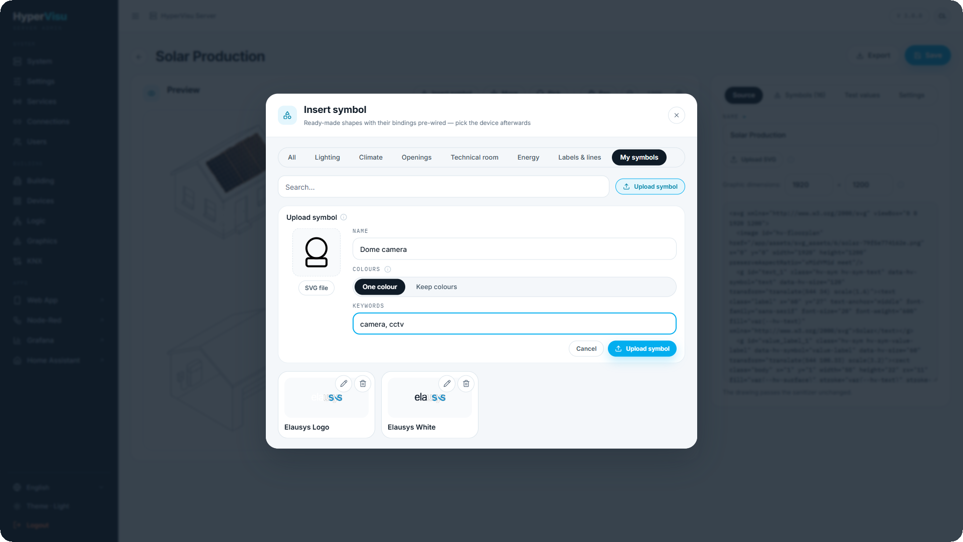
My symbols. Under the My symbols category, Upload symbol adds an SVG icon of your own — a camera, a logo, a piece of equipment the library lacks:
| Field | Meaning |
|---|---|
| SVG file | The icon, at most 256 KB. It goes through the same sanitizer as a drawing |
| Name | How it appears in the library |
| Colours | One colour redraws the icon in the drawing's text colour, so a binding can turn it green or red. Keep colours preserves the artwork as it is and only allows show / hide |
| Keywords | Words the search box finds it by |
A custom symbol carries no pre-wired rows: add the bindings and actions you need after placing it. Every graphic that uses it keeps its own copy, so renaming or removing the symbol from the library never touches an existing graphic.
Bindings
A binding changes one shape when one value changes. Open a symbol (or an element under Other elements), then the Bindings sub-tab. Each row has four parts:
Selector — which shape the binding drives. For a symbol's own rows it is filled in (#lamp_1 .body); for a hand-drawn shape it is the shape's id.
Source — where the value comes from:
| Source | Fields |
|---|---|
| Device | A device and one of its objects — the light's switch state, the meter's power, the sensor's reading |
| Function | A function of the Logic engine and one of its outputs (see “Function Setup & Outputs”) |
| Static | A fixed value you type — useful to test a rule or to force a state |
What changes — what the value does to the shape:
| Kind | Effect | Extra fields |
|---|---|---|
| Attribute | Sets an SVG attribute (fill, stroke, opacity, width…) | the attribute name |
| Style | Sets a CSS property | the property name |
| Text | Replaces the shape's text with the value | digits, unit and a template such as {value} {unit} |
| Class | Adds a class while the value is on, removes it otherwise | the class name — pair it with Extra CSS |
| Visibility | Shows the shape when the value is on, hides it otherwise | — |
| Transform | Rotates, moves or scales the shape by the value | the operation |
| Animation | Drives an animation row (see Animations below): run while on, speed (dur) or direction by sign | the animation and the mode |
| Symbol (href) | Swaps the shape for another #symbol of the drawing | — |
Mapping — how the value becomes what the shape needs:
| Mapping | What it does | Example |
|---|---|---|
| Direct | The value is used as is | a temperature into a Text |
| On / off | One result when on, another when off | #facc15 when on, #64748b when off, for a lamp's fill |
| Range | Maps a value range onto an output range; Clamp to the range stops it at the ends, Use the magnitude ignores the sign | 0–100 % into a cover moved by −28 to 0 |
| Thresholds | Steps: up to a value gives a result, then the next, then otherwise | up to 15 red, up to 30 orange, otherwise green, for a tank |
| Lookup | A table of exact values, with otherwise for anything else | 1 → Open, 0 → Closed, for a status word |
💡 Tip: The library's rows are the best examples: place a Status indicator and read its three bindings — the dot's fill (On / off), the halo's fill (On / off) and the state word (Lookup). Edit the two words in the Lookup to say "Open" and "Closed", or "Armed" and "Disarmed".
Actions
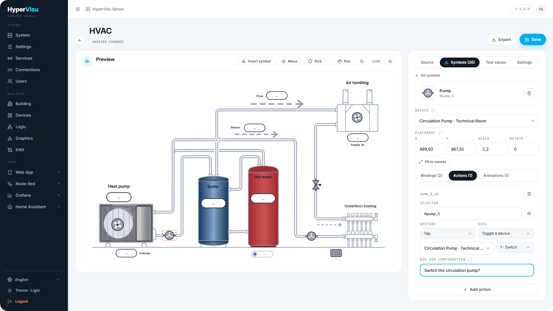
An action runs a command when a shape is touched. Open a symbol's Actions sub-tab, or add one to a hand-drawn shape.
| Field | Choices |
|---|---|
| Selector | The shape that receives the gesture — usually the whole symbol |
| Gesture | Tap, Double tap, Long press |
| Does | Set a device value (with the Value to send) · Toggle a device · Step a device value · Open the device's room · Open the device's detail (the page its tile opens; a device without one opens its room) · Run a scenario · Run an automation · Global command (lights or shutters, for the whole building, a room or a category) · Go to a view · Go to a room · Go to a category |
| Ask for confirmation | A question shown before the action runs, such as Start the pump?. Leave it empty to run immediately |
The same shape can carry several actions with different gestures: in the Pump station example, a pump toggles on a tap (after a confirmation) and opens its device on a long press.
📘 Note: Device commands, scenarios and automations run on the server, whatever app sent them. Open the device's room, Open the device's detail, Global command, Go to a view, Go to a room and Go to a category happen inside the app that was tapped, so the admin preview cannot run them.
📘 Note: Users only get the actions their account may use. A symbol bound to a device outside a user's rooms and categories is a plain drawing for that user; a global command on the whole building is reserved to administrators.
Animations
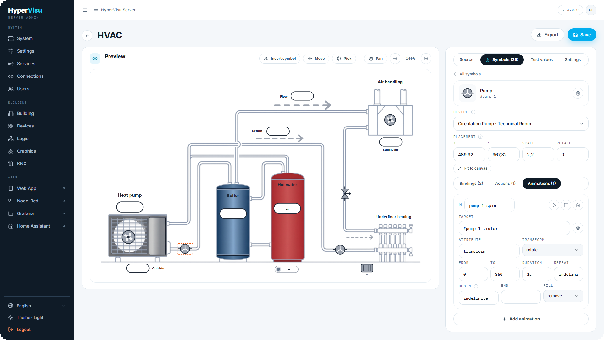
An animation row adds a continuous movement to a shape — a spinning rotor, dashes that run along a line, a blinking lamp — that bindings start, stop, speed up or reverse.
| Field | Meaning |
|---|---|
| Target | The shape that moves (#pump_1 .rotor) |
| Attribute | What is animated: transform for a movement, or an attribute such as stroke-dashoffset or opacity |
| Transform | For transform: rotate, scale, translate, skewX, skewY — a rotation turns about the symbol's centre |
| From, To | The start and end values |
| Duration | One cycle, such as 1s |
| Repeat | A count, or indefinite |
| Begin | indefinite when a binding starts it, load to run as soon as the graphic shows, or an SMIL list such as pump1.click; spin.end+1s |
| End, Fill | The standard SMIL end condition and what remains when the animation stops |
To make an animation follow the installation, add a binding whose What changes is Animation: run while on starts and stops it with a state, speed (dur) sets its cycle from a value (a Range mapping from watts to seconds), direction by sign runs it backwards for negative values — the Flow line uses all three.
Testing, settings, export
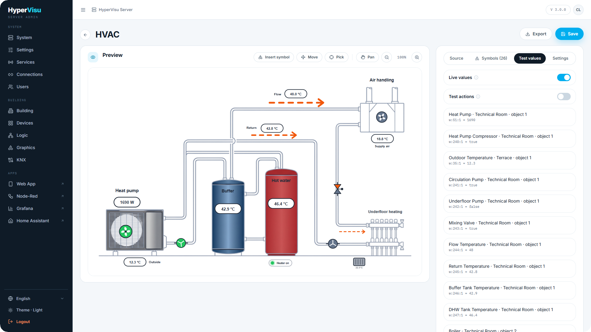
Test values. The tab lists one input per bound value so you can type a reading and watch the preview react. Switch on Live values to feed the preview with the installation's real values instead. Test actions (which needs Live values) makes clicks in the preview run their action on the server — toggling devices, running scenarios and automations — so you can try a graphic before residents see it. Actions that happen inside an app (opening a room, global commands, going to a view) are reported but not run.
Settings.
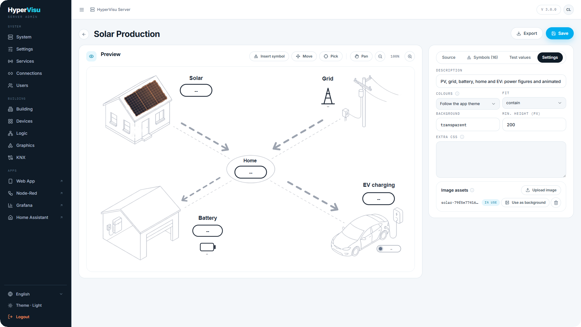
| Setting | Meaning |
|---|---|
| Description | A note shown in the list |
| Colours | Follow the app theme — symbols and labels take the app's text colour; Light drawing — dark strokes whatever the theme, for a white background image; Dark drawing — light strokes whatever the theme |
| Fit | How the drawing fills its card: contain shows it whole, cover fills the card and crops |
| Background | A colour behind the drawing, or transparent |
| Min. height (px) | The card is never shorter than this |
| Extra CSS | A stylesheet applied to the drawing — classes for Class bindings, keyframes, transitions |
| Image assets | The pictures the drawing may reference (PNG, JPEG, WebP). Upload image adds one; Use as background places it as the drawing's background and resizes the graphic to it. A picture the drawing still uses is marked in use and cannot be deleted; when you replace the background, the editor offers to delete the previous file |
Export and import. Export downloads a graphic as a bundle file: the drawing, its rows, settings and pictures in one file. Import bundle on the Graphics page creates a graphic from such a file. Device, function, scenario and view references are matched by name; a reference that matches nothing is dropped and the import says how many. This is how the two examples travel, and how a graphic moves from one installation to another.
Backups. Graphics and your custom symbols live in the server database, so they are part of the server backup (see “Backup & Restore”). The pictures a graphic references are stored as files and are not in the backup: export the graphic as a bundle to keep them with it.