
The app ships in three presentations: phone, tablet, and 4″ wall panel. Features are identical; only the layout changes to fit the screen. This section is what differs.
Tablet layout
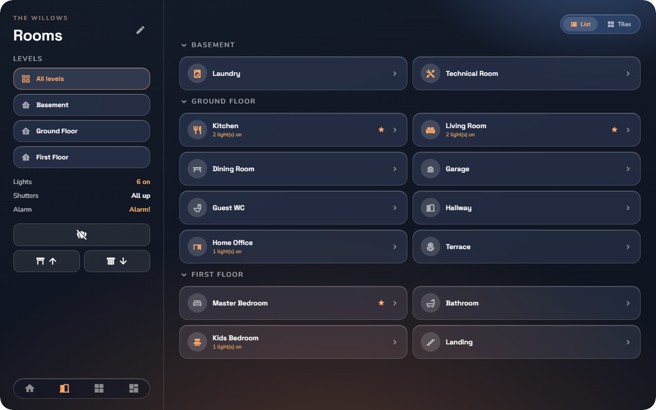
- A fixed rail on the left carries the page's identity and tools: title, filters (such as the floor levels), the live house summary, the global command buttons, and the main navigation docked at the bottom.
- The content area on the right holds the page itself; wide pages split into two columns.
- Navigation is master–detail: tapping a room swaps the content in place — nothing slides in from the right, and the rail stays put. On a room's page, the rail becomes that room's: back button, room name and floor, photo, live summary and the room's global commands.
- Pickers and dialogs open as centred modals over a dimmed backdrop instead of full-screen pages.
- The phone's Configuration sheet becomes the Configuration rail: Scenarios, Automations, Functions, Device groups, Views, App settings and System listed on the left, the selected page on the right.
- Settings and System split into two columns when the window is wide enough, and stack on a narrow one.
The 4″ wall panel (480 × 480)
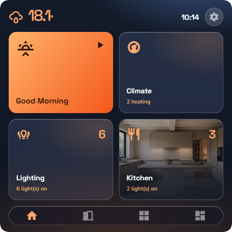
The wall panel layout is built for a small square touch screen at arm's length:
- Content is a paginated grid — swipe between pages, dots show where you are.
- A clock sits in every list header, and a full-width navigation pill is docked at the bottom.
- Tapping a device opens its control as a full-screen overlay — the whole panel becomes that one shutter or thermostat, with a close button to return.
- Scenarios appear as large launcher pads — one tap runs the scene.
💡 Tip: On a wall panel, turn on Settings → Appearance → Reduce transparency. The frosted-glass blur is expensive on panel hardware, and the flat surfaces are also easier to read at an angle.
One home, three shapes
Your personalization follows the form factor automatically: the home editor's section order applies to phone, tablet and wall panel alike (see “App Settings & Personalization”), and the theme, accent and page-style settings are per device — so the wall panel can run flat and dark while your phone stays glassy.
| Phone | Tablet | 4″ wall panel | |
|---|---|---|---|
| Navigation | Bottom bar | Docked in the left rail | Full-width pill at the bottom |
| Lists | Scroll | Scroll (rail fixed) | Paginated grid, no scrolling |
| Device detail | Detail page | Detail in place, rail stays | Full-screen overlay |
| Pickers | Sheets / pages | Centred modals | Full-screen overlays |
| Clock | Phone status bar | — | Drawn in every list header |